


What’s the first fun task now that 2019’s arrived? Tackling the overwhelming number of End of Year surveys about our industries. These surveys are designed to give business owners insights about their performance, compared to what the competition is doing.
How valuable are these insights? The answer is – it depends. The quality of the insights is contingent on the quality of the survey. Any time you’re looking for insights in data, you need to understand where that data came from. This will help you understand how much importance you want to attach to it.
Do You See What I See?
Good design dictates that data should be understandable at a glance, but good decision making happens when you take a little time and look at the details. Remember, data absent context doesn’t help you. For example, check out a typical End of Year survey for retailers:
Holiday Season for Jewelry Stores – Instore Magazine[i]
Q: How was traffic compared to last year?
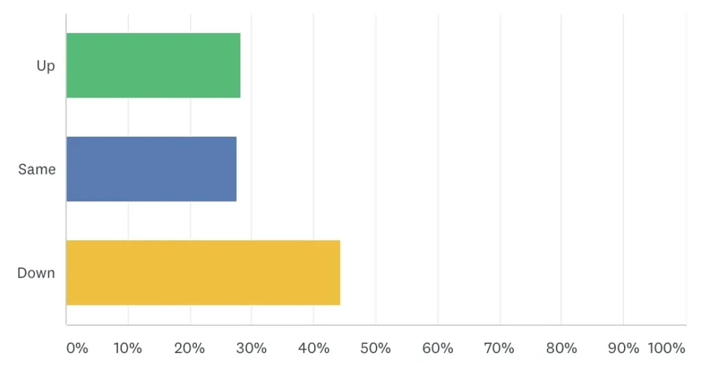
What’s wrong with this nice-looking chart? It’s the question that’s troublesome, for a couple of reasons. First, it’s reporting data that doesn’t actually exist – most stores don’t actually track traffic in or out of their stores. What’s actually here is the summation of anecdotal replies, designed in part to make the reader feel better – you’re either doing better than everyone else, about the same as everyone else, or, if you’re suffering, at least you’re not suffering alone.
Another thing you want to look at is what’s being compared. There are jewelry stores that sell engagement rings that cost $100, and there are jewelry stores that sell engagement rings that cost $1,000,000. We don’t have a classification by store types; mall stores vs. stand-alone stores. And geography is a thing, too. Tons of people moved to Austin last year – so is a boost in their traffic due to performance or simply a result of a population boom?
Here’s another example. This time, it’s from the marketing world:
Emarketer – Five Charts: The State of Retail Tech[ii]
Hint: Be sure to read the fine print
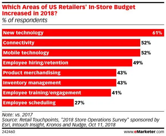
This chart also looks great. It’s important to go a little deeper. If you read the fine print and go to the source, guess what you find out? This survey represents the opinion of 115 US retail professionals. We don’t know what role those professionals occupy, and that’s important because every profession has its own agenda and priorities.
If we set aside the professional role question, we’re still left with some pretty vague answers. New technology can mean literally anything, from cutting edge robotics and AI all the way down to upgrading the POS system.
Point Being: That Data Might Be Good but You Won’t Know if You Don’t Look
Infographics have their limitations. It’s not possible to put every detail into a chart that needs to be read on a smartphone screen. If we want to know more, it’s on us to take the next step, do a little research, and think about what we find.
Here at Home: How to Get More Value Out of Your Year End Reports
I could go about this with lots of charts – so what’s the point? The point is this is how too many business review their own data. They look at quick reports without really understand how the information they’re looking at made it onto that report. They trust charts blindly.
Do you think you’re not doing that? Here’s an exercise. Let’s use another common report – the average ticket. What’s yours? The odds are pretty good you know that number.
But how did your store wind up with that average ticket? Are you sure that the number you’re looking at is truly representative of your store’s performance? This is where delving into the details and digging even just a little deeper can yield meaningful insights.
When you look at sales trends, I recommend looking at the median – not the average. Why? Because outliers – results that are not representative of typical performance – can skew an average dramatically. A small number of really high or really low sales can disrupt your average. Look instead at the number that falls into a common cluster.
Want to try it again?
Go back and review your marketing. Find out what you shared the most on social media. What did you spend money advertising with your Google Ads? You won’t get the big-ticket sales if you’re promoting the loss leaders – especially true if you’re a small business. When we look at our own data, we need to dig into the specifics.
When you review those end of year charts, remember to look at the details. And when you review your own numbers, do the same.
[i] https://instoremag.com/late-rush-arrives-to-rescue-the-holiday-season/
[ii] https://retail.emarketer.com/article/five-charts-state-of-retail-tech/5c2d3ab3b979f10b7474d7d2?ecid=NL1014